Guidelines for Writing Scientific Works in Information Systems
2024 • IX • 3
A scientific (written) work should always be scrutinized in terms of both content and form. In its original version, the author is responsible for both. Herein, I can not—and do not intend to—help you regarding content. You must know what you are reporting, and, hopefully, the scientific work you present will be rigorous and relevant. But maybe I can be of some assistance regarding form...
Between content and form, content is always the most important. However, form is not negligible. Poor-formatting can impair the reading and understanding of the content. Ultimately, the meaning and intent of the scientific work may not be grasped.
What follows is a collection of typographical guidelines to keep in mind when writing scientific works in Information Systems. Most of these guidelines are likely applicable across many research domains. Note that some of the guidelines may be debatable, but bear in mind that the guidelines are provided according to general (classical) typographical practices, with some being informed by Portuguese typographical tradition. This set of guidelines will not prevent sloppy or careless works, but it may help you make better format-related decisions.
Do not write in the first person. The documents we are dealing with are of a technical-scientific nature. Restrict the discourse to the third person singular.
If you include indexes, consider the following, in the order presented: Table of Contents, List of Figures, List of Tables, List of Graphics, List of Abbreviations.
Ensure consistent numbering for chapters, sections, subsections, figures, tables, etc.. Double-check that they match any indexes.
If you have a List of Abbreviations, make sure it is presented in alphabetical order of abbreviation.
Having abbreviations, make sure you define them in their first use in the body of the document, even if you provided in the beginning of the document a List of Abbreviations. For instance, if I want to use the abbreviation IS for the expression “ If using abbreviations, be sure to observe the number in the definition in the List of Abbreviations and on the definition of the abbreviation. If the abbreviation IS is associated to the expression “ “ “ Let the different components (paragraphs, figures, tables, etc.) of your document breathe. Using adequate and sufficient spacing is absolutely critical.
Although spacing is crtitical (some say it is the most difficult competency to master in composition), avoid white space in pages—if needed, move floats (figures, tables, graphics, etc.) or pull subsequent text to fill the white space.
Make the paragraphs recognizable. Indent the first line of the paragraph or increase the spacing between paragraphs compared to the spacing between lines within a single paragraph. According to certain typographical traditions, if you indent the first line of paragraphs, that first line should not be indented if it is the first paragraph of a chapter, section, or subsection, and, in certain cases, after the presentation of a float.
If you have floats make sure all of them have a sensible label and are numbered. For instance, “ “ Place the labels of figures and graphics below the figures and graphics and the labels of tables above the tables. Make sure the labels of all floats are attached to the respective floats (do not allow them to separate over pages).
Having floats, make sure you mention each and everyone of them in the text.
If a table does not fit on one page, be careful how you split it.
In tables, check the alignment of each column. Pay attention to the alignment of the column labels. Be specially carefull with columns containing numbers with decimal points or thousands separators.
If you include figures in your document, check their quality. Any text, forms, and colors should work well together, facilitating the assimilation of the message. Be particularly careful with export and import operations from other applications. Favor vector graphics over raster graphics.
When including floats, observe the margins of the page. Do not exceed them!
If your document has portrait oriented pages, if you need to put a component (e.g., a figure or a table) in landscape orientation, make sure the header and the footer of the page, if any, keep their portrait orientation (i.e., rotate only the float).
Usually, at its most complex form, a document is organized in volumes, numbers, parts, chapters, sections, and subsections, from the largest unit to the smallest unit of content organization. There are no such things as “ Ensure that no section or subsection stands alone without at least one peer of the same hierarchical level. If you cannot ensure this, incorporate the single section or subsection into its parent unit.
If your document distinguishes between front and back pages, consider beginning each new chapter on a front page with an odd-numbered folio (page number).
Consider labelling chapters, sections, subsections, figures, tables, graphics, etc., with expressions whose words begin with a capital letter, except for linking words. A few examples: “ “ “ “ If you are writing integer numbers outside a mathematical context, the rule of thumb is to write the number in full up to nine. From 10 onwards, it is written with numerals. So, one would write: “ There are hyphens (-), en-dashes (–), and em-dashes (—).
Examples of the use of hyphens: one-way, up-or-out, seventy-four, mid-March, X-ray, self-confident.
Examples of the use of en-dashes:
John von Neumann (1903–1957) was one of the ‘ ‘
The paper spans pages 679–707.
FC Porto defeated Bayern München 2–1 on the 1987 European Cup final.
The Oporto–Lisbon trip by train takes almost three hours.Examples of the use of em-dashes:
Fyodor Dostoyevsky—the Russian novelist—spent four years in a Siberian prison camp.
In Spain, there are multiple languages—Castilian, Catalan, Galician, Basque, Aranese, Astur-Leonese, Aragonese, and Fala.Quoting Mark Twain: “
(note that in Portuguese a space is always inserted after the em-dash and before the em-dash, unless the em-dash is at the beginning of the phrase)If you are using words of a different language in your document, think twice (unless you are writing a document in the field of philology). Are you sure there is no word in the language you are writing with the meaning attached to the foreigner expression you are trying to use? An example if you were writing in Portuguese: do not use the English word “ “ “ If you use figures or tables from other authors, besides the adequate citation ( “ “ “ If your document has appendices or annexes, make sure you refer to each one of them in the body of the document. In the beginning of each appendix/annex provide one to three paragraphs presenting its contents and making any considerations required for the reader to better understand it.
Use an appropriate citation and referencing style. Ensure uniformity in the application of the style.
Make sure all citations in the document have corresponding references. Make sure that the list of references does not contain entries that are not cited in the document.
If you are writing in Portuguese, bear in mind:
Ordinal numerals presented in the form of numbers are graphed as follows: 1.º, 1.ª, 2.º, 2.ª, 3.º, 3.ª, ...
Do not confuse methodology with method. Methodolody comes from the Greek metodologia and método.“ “ If you need to translate the English word consistent to Portuguese, probably, the correct word will be coerente (and not consistente).
Think twice about italicizing literal quotations, whether inline or not. Generally, there is no reason to do so. There are even fewer reasons to underline text.
Be sparing with adjectives. With very rare exceptions, it is best not to use them at all.
Pay attention to translineation conventions of the language you are writing in.
Take care of “ “
When doing the final check of a document, do it on the format the reader will use. Do not place your trust in WYSIWYG (What You See Is What You Get) intermediate formats.
If you got this far, you have easily concluded that the provided guidelines are very basic. If you want to know the reasons, alternative styles and more advanced guidelines, I leave below a set of solid references that you can use (I have included references on typography and digital composition, but I have left out references on typefaces and design of books and other more elaborate documents). From the ones listed, you will easily find the specialty references whose consultation you will realize you need.
Bringhurst, R. (2013). The Elements of Typographic Style. Fourth ed. Point Roberts: Hartley & Marks.
McLean, R. (1980). The Thames and Hudson Manual of Typography. London: Thames and Hudson.
Knuth, D. E. (1986). The TeXbook. Reading, Massachusetts: Addison-Wesley Publishing Company.
Lamport, L. (1994). LaTeX—A Document Preparation System. Reading, Massachusetts: Addison-Wesley Publishing Company.
UPDATE, 2025 • II • 14
When I review my students’ works, I often use proofreading marks to signal changes I think should be made or to highlight comments or issues that students should pay attention to. I do not use an extended set of marks (cf. The Chicago Manual of Style Proofreaders’ Marks), but I denote them in red ink for easier identification throughout the document.
For the benefit of my students, here is a page illustrating the result of a review (note that the base text is nonsense—it was generated for the sake of demonstration).
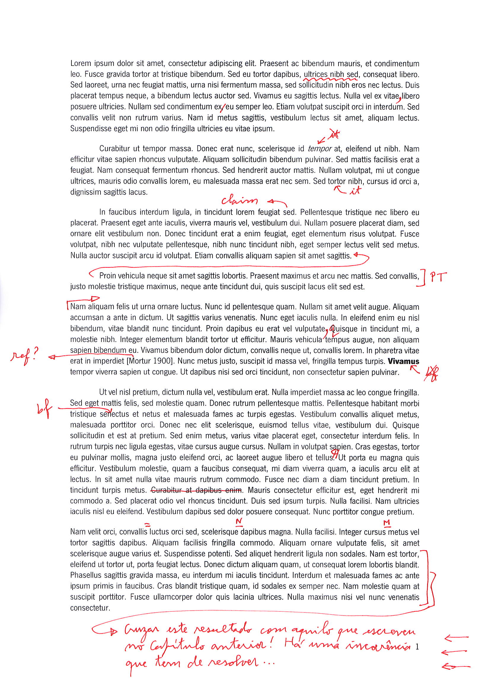
Here is the explanation of the annotations by paragraph and in order of appearance:
First paragraph
The wavy line indicates I dislike the word or expression—it is not appropriate for the context. Find a more suitable alternative.
Insert a comma after the word vitae (this applies to similar punctuation situations).
Remove the comma after the word ex (again, apply this correction to similar instances).
Second paragraph
Do not set word (tempor, in the example) in italics.
Set the word (tortor, in the example) in italics.
Third paragraph
The mark claim flags a statement that requires justification or support. Tipically, a citation will be needed.
Fourth paragraph
The arrow means “ The mark PT (or EN, if the work is in English) indicates the sentence(s) need require linguistic revision.
Fifth paragraph
The arrow means “ Change the period to a comma, lowercase the following word (apply this correction in similar cases).
The mark ref? indicates that the citation is missing a corresponding reference entry.
Do not set word (Vivamus, in the example) in boldface.
Sixth paragraph
Set the word (senectus, in the example) in boldface.
Insert a paragraph (starting in Ut, in the example).
Delete the text (Curabitur at dapibus enim., in the example).
Seventh paragraph
Insert a hyphen (bewteen covallis and luctus, in the example).
Insert an n-dash (bewteen scelerisque and dapibus, in the example).
Insert an m-dash (bewteen cursus and metus, in the example).
The final annotation is an example of a general comment regarding a passage. The exact content is not important here; what matters is that I am alerting the author to a significant issue that must be addressed. Take note of the arrows at the right margin. The number of arrows indicates the seriousness of the problem (so far, I have capped it at ten arrows).
© 2025– Filipe de Sá-Soares. All rights reserved.